# load packages
library(modeldata)
library(tidymodels)
library(tidyverse)
library(gt)
library(vip)

data("credit_data")

credit_data <- credit_data %>%
  drop_na()

set.seed(12)

# initial split
split <- initial_split(credit_data, prop = 0.75, strata = "Status")

# train/test sets
train <- training(split)
test <- testing(split)

rec <- recipe(Status ~ ., data = train) %>%
  step_bagimpute(Home, Marital, Job, Income, Assets, Debt) %>%
  step_dummy(Home, Marital, Records, Job, one_hot = T)

# Just some sensible values, not optimised by any means!
mod <- boost_tree(trees = 500,
                  mtry = 6,
                  min_n = 10,
                  tree_depth = 5) %>%
  set_engine("xgboost", eval_metric = 'error') %>%
  set_mode("classification")

xgboost_wflow <- workflow() %>%
  add_recipe(rec) %>%
  add_model(mod) %>%
  fit(train)

xg_res <- last_fit(xgboost_wflow,
                   split,
                   metrics = metric_set(roc_auc, pr_auc, accuracy))

preds <- xg_res %>%
collect_predictions()Opening the black box: Exploring xgboost models with {fastshap} in R
Being able to understand and explain why a model makes certain predictions is important, particularly if your model is being used to make critical business decisions. This post takes a look into the inner workings of a xgboost model by using the {fastshap} package to compute shapely values for the different features in the dataset, allowing deeper insight into the models predictions.
While maximising a models performance is often desirable, it can sometimes limit the explainability. Being able to understand why your model is making certain predictions is vital if the model is going to be used to make important business decision that will need to be explained. This post is going to explore how we can use SHapley Additive exPlanations (SHAP) to dig a little deeper into complex models in an attempt to understand why certain predictions are made.
Initial model
First we’ll need a model to explain. The code below is borrowed from a previous post using the tidymodels workflow (see here).
Quick check of our hastily thrown together model:
xg_res %>%
  collect_metrics()
# A tibble: 3 × 4
.metric .estimator .estimate .config
<chr> <chr> <dbl> <chr>
1 accuracy binary 0.798 Preprocessor1_Model1
2 roc_auc binary 0.834 Preprocessor1_Model1
3 pr_auc binary 0.581 Preprocessor1_Model1Not bad! We can now begin unpicking the model to understand the predictions further.
Variable importance
Before getting to SHAP, we can do a quick check of what variables are most important. The vip package is an excellent choice for this, providing a “model agnostic” approach to assess variable importance (Greenwell, Boehmke, and Gray 2020).
library(vip)

# Get our model object
xg_mod <- pull_workflow_fit(xgboost_wflow)

vip(xg_mod$fit)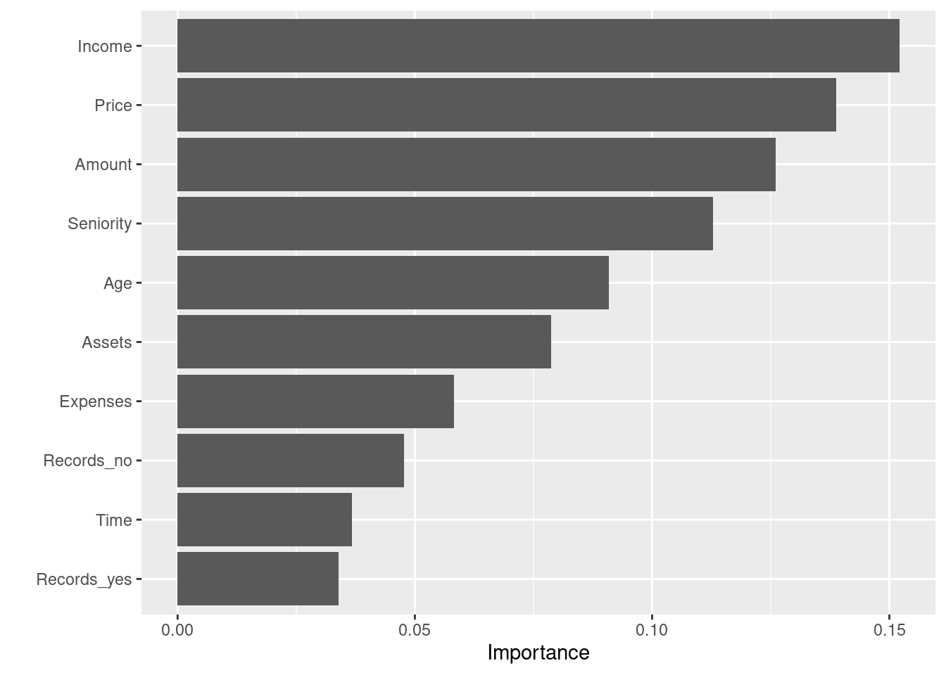
This gives us a good first insight into what variables are contributing the most within the model. “Income” and “Price” appear to be strong predictors in the model, but we can dig a little deeper with fastshap.
Fastshap
For a brief introduction to SHAP, Scott Lundberg (developer of the SHAP approach and shap python package) has a great talk here that gives a shortish (~18mins) overview of the main concepts. You can also review the paper (Lundberg and Lee 2017) for a more in-depth look into the theory underpinning SHAP. As a very high level explanation, the SHAP method allows you to see what features in the model caused the predictions to move above or below the “baseline” prediction. Importantly this can be done on a row by row basis, enabling insight into any observation within the data.
While there a a couple of packages out there that can calculate shapley values (See R packages iml and iBreakdown; python package shap), the fastshap package (Greenwell 2020) provides a fast (hence the name!) way of obtaining the values and scales well when models become increasingly complex. Below, we’ll walk through some of the main functions in the package and how they can help aid explanations.
You can actually access fastshap directly from the vip package using vip::vi_shap() which uses fastshap under the hood.
First, we need to supply the fastshap::explain() function with the model and the features we used to train the model. As we used some preprocessing steps, we’ll need to prep and juice our training data to ensure it is the same as the data that was used in the model.
library(fastshap)
Attaching package: 'fastshap'The following object is masked from 'package:vip':
gen_friedmanThe following object is masked from 'package:dplyr':
explain# Apply the preprocessing steps with prep and juice to the training data
X <- prep(rec, train) %>%
juice() %>%
select(-Status) %>%
as.matrix()
# Compute shapley values
shap <- explain(xg_mod$fit, X = X, exact = TRUE)With our shapley values calculated, we can explore the values in several ways. fastshap has a great autoplot ability to quickly visualise the different plots available.
Shapley importance
autoplot(shap)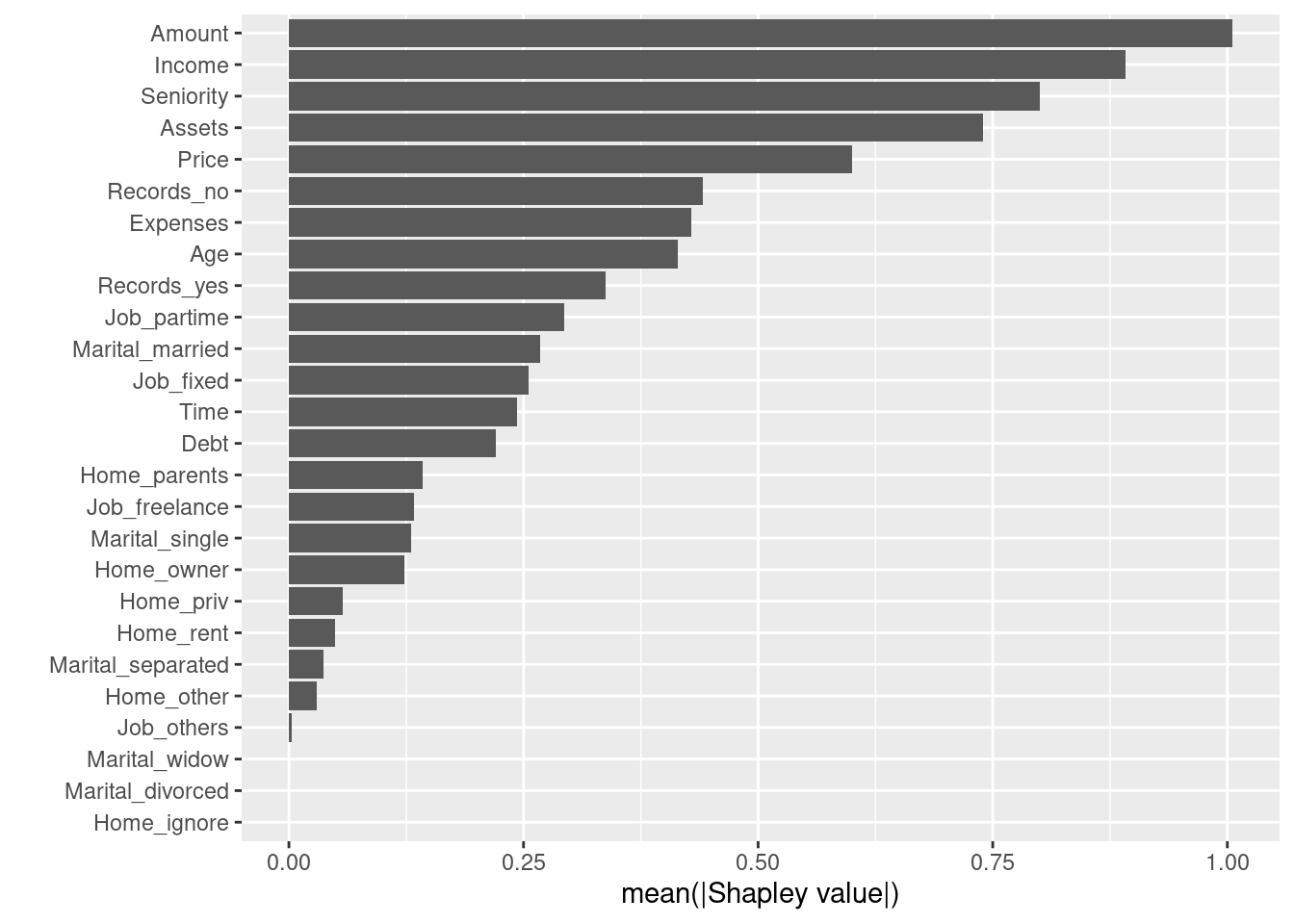
Interestingly, “Amount” is clearly the most important feature when using shapely values, whereas it was only the 4th most important when using xgboost importance in our earlier plot.
Dependence plot
We can focus on on attributes by using a dependence plot. This allows us to see the relationship between shapely values and a particular feature.
# Create a dataframe of our training data
feat <- prep(rec, train) %>%
  juice()

autoplot(shap,
         type = "dependence",
         feature = "Amount",
         X = feat,
         smooth = TRUE,
         color_by = "Status")
`geom_smooth()` using method = 'gam' and formula 'y ~ s(x, bs = "cs")'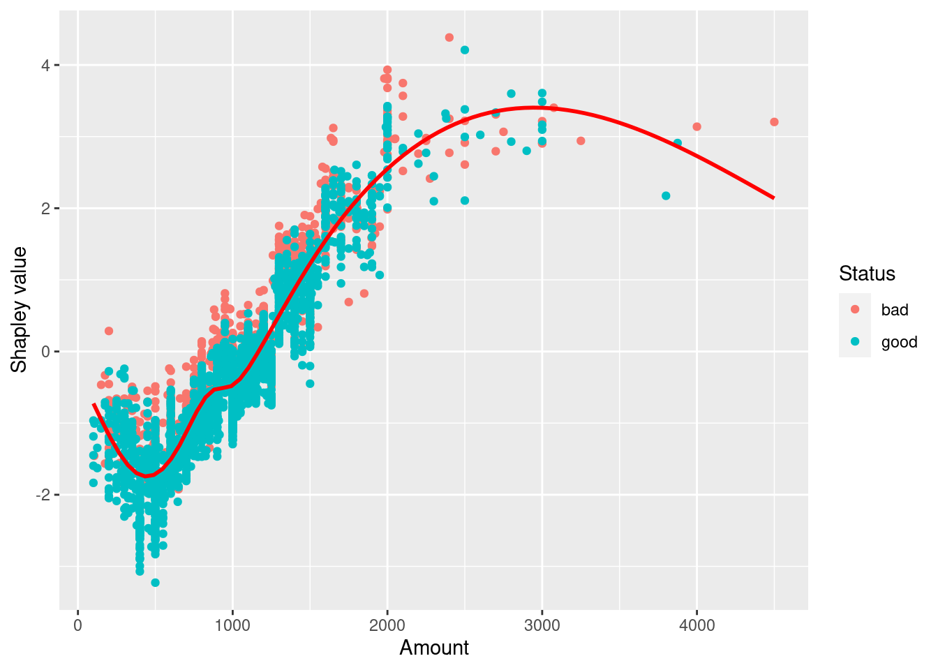
Contribution plots
Contribution plots provide and insight into individual predictions. I’ve identified two extreme cases where the prediction probability is almost 100% for each class:
predict(xgboost_wflow, train, type = "prob") %>%
  rownames_to_column("rowid") %>%
  filter(.pred_bad == min(.pred_bad) | .pred_bad == max(.pred_bad)) %>%
  gt()%>%
  fmt_number(columns = 2:3,
decimals = 3) | rowid | .pred_bad | .pred_good |
|---|---|---|
| 450 | 0.999 | 0.001 |
| 2871 | 0.000 | 1.000 |
We can visualise what features made these extreme predictions like so:
library(patchwork)
p1 <- autoplot(shap, type = "contribution", row_num = 1541) +
  ggtitle("Likely bad")

p2 <- autoplot(shap, type = "contribution", row_num = 1806) +
  ggtitle("Likely good")

p1+p2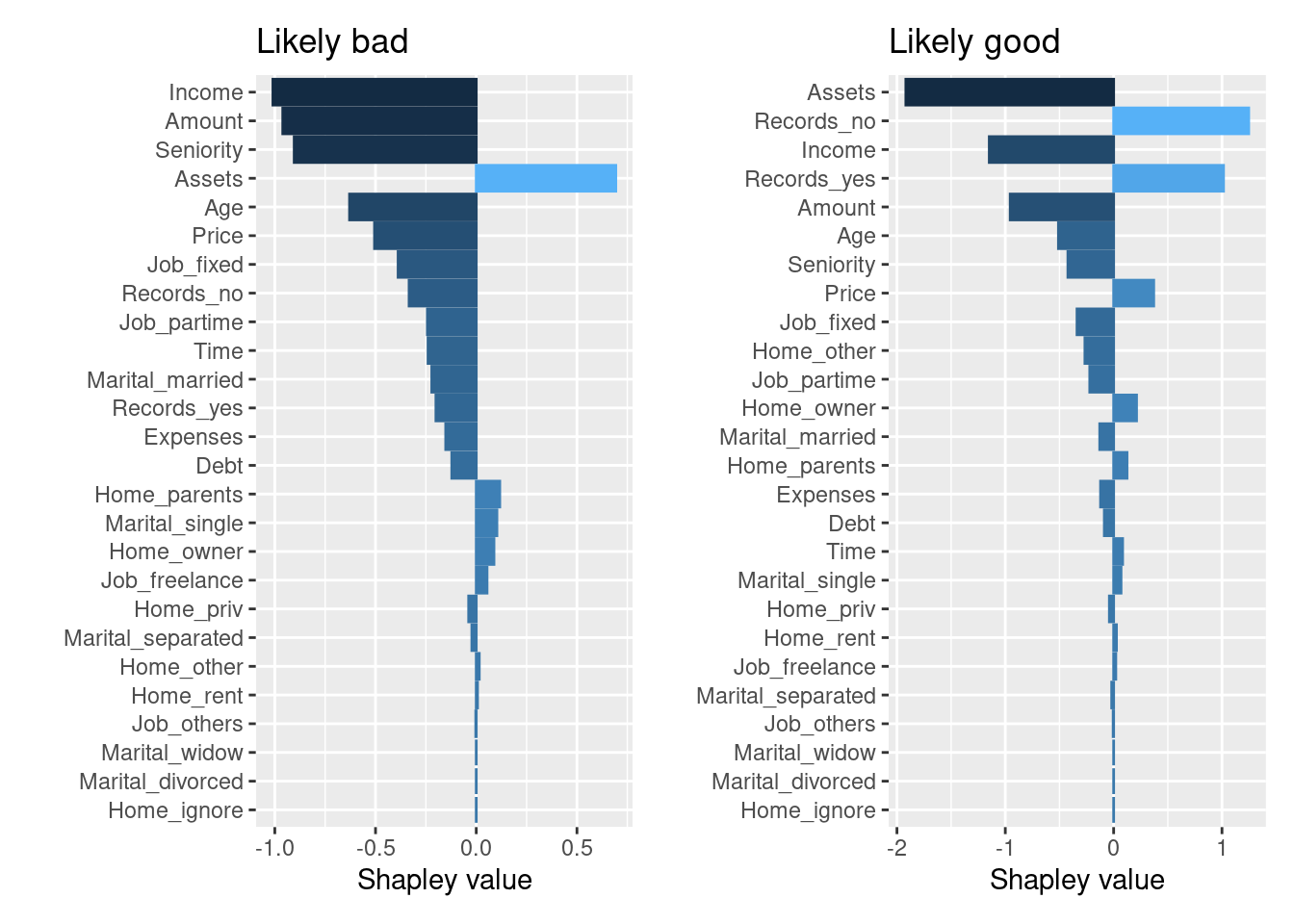
In the “likely bad” case, we can see “Income” and “Amount” having a negative impact on prediction, whereas in the “likely good” case, “Amount” and “Seniority” having a positive impact. However, these plots still are not telling us why these features had the impact they did.
You can of course recreate these plots from the original explain() output without using autoplot if needed.
Enter Force plots.
An extension of this type of plot is the visually appealing “force plot” as shown here and in Lundberg et al. (2018). With reticulate installed, fastshap uses the python shap package under the hood to replicate these plots in R. What these plots show is how different features contribute to moving the predicted value away from the “baseline” value. The baseline being the average of all predictions (Note: in this case, the baseline score is the average probability of the “good” class).
I had to stretch these out so they didn’t get squished when rendering the markdown document…
Likely bad
force_plot(object = shap[1541,],
           feature_values = X[1541,],
           display = "html",
           link = "logit")
Using shap version 0.38.1.Our bad example shows the features and specific values that move the predicted probability lower from the baseline probability. The combination of a relatively low income and high loan amount seem to indicate a much higher probability of a “bad” outcome (or in this case a lower probability of “good” outcome).
Likely good
force_plot(object = shap[1806,],
           feature_values = X[1806,],
           display = "html",
           link = "logit")
Using shap version 0.38.1.In the good example, “Amount” and “Seniority” act to increase the probably of a “good” outcome.
A final approach we can use is to pass multiple values into the force_plot() function. By taking a selection of observations, rotating them 90 degrees and stacking them horizontally, it is possible view explanations for multiple observations. Here I’ve just taken the first 50 values 1. The plot is also interactive, so you can explore the effects of each different features across the 50 samples.
force_plot(object = shap[c(1:50),],
           feature_values = X[c(1:50),],
           display = "html",
           link = "logit")
Using shap version 0.38.1.Summary
So that was a quick look at the excellent fastshap package and what it has to offer. I’m still learning the ins and outs of SHAP this was by no means a comprehensive overview of the topic. As models become increasingly complex, the tools to help explain them become even more important and SHAP seems to provides a great way to shine a light into the “black box” of the inner workings of complex models.
Any feedback is more than welcome and thanks for reading!
References
Greenwell, Brandon. 2020. Fastshap: Fast Approximate Shapley Values. https://CRAN.R-project.org/package=fastshap.
Greenwell, Brandon, Brad Boehmke, and Bernie Gray. 2020. Vip: Variable Importance Plots. https://CRAN.R-project.org/package=vip.
Lundberg, Scott M, and Su-In Lee. 2017. “A Unified Approach to Interpreting Model Predictions.” Edited by I. Guyon, U. V. Luxburg, S. Bengio, H. Wallach, R. Fergus, S. Vishwanathan, and R. Garnett, 4765–74. http://papers.nips.cc/paper/7062-a-unified-approach-to-interpreting-model-predictions.pdf.
Lundberg, Scott M, Bala Nair, Monica S Vavilala, Mayumi Horibe, Michael J Eisses, Trevor Adams, David E Liston, et al. 2018. “Explainable Machine-Learning Predictions for the Prevention of Hypoxaemia During Surgery.” Nature Biomedical Engineering 2 (10): 749.
Footnotes
I think the output isn’t quite complete here… seems to have cut off the right side of the plot - maybe due to saving the original python output to html and reading back into R?↩︎